
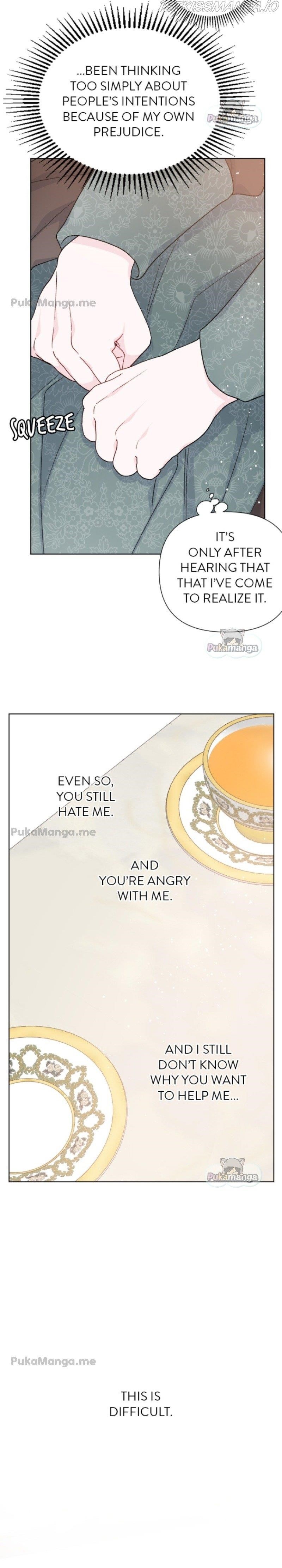
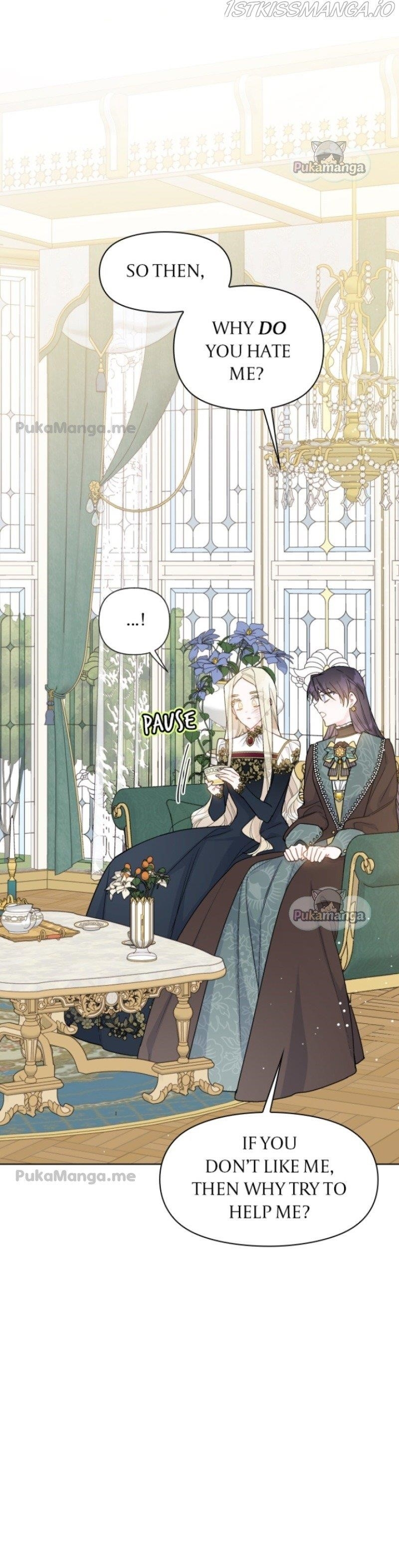
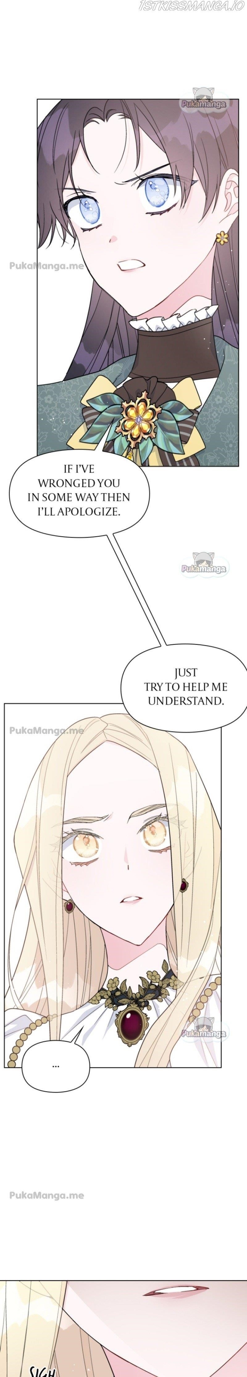
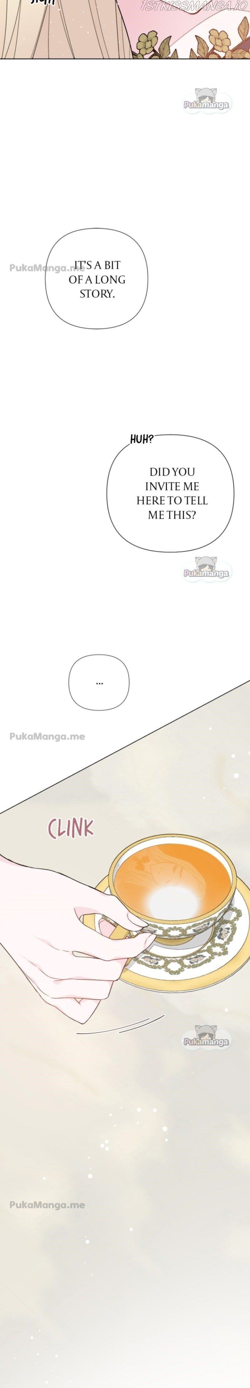
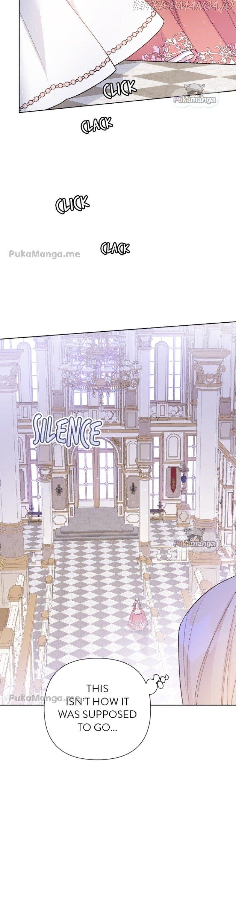
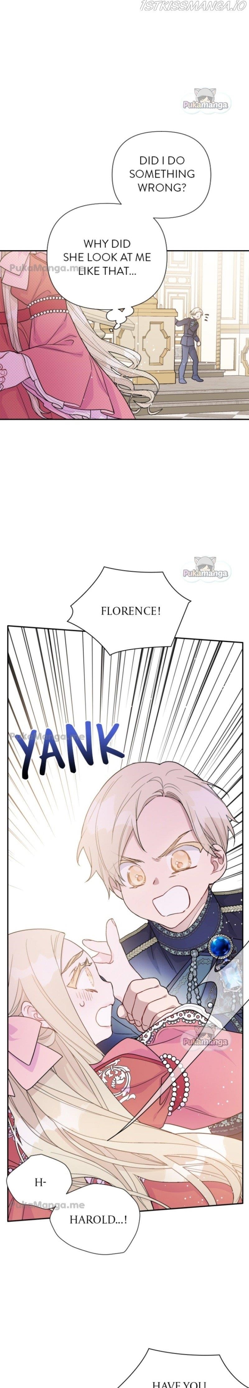
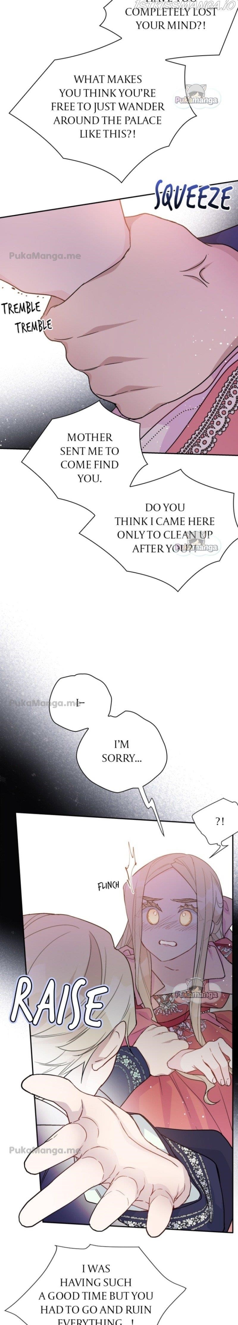
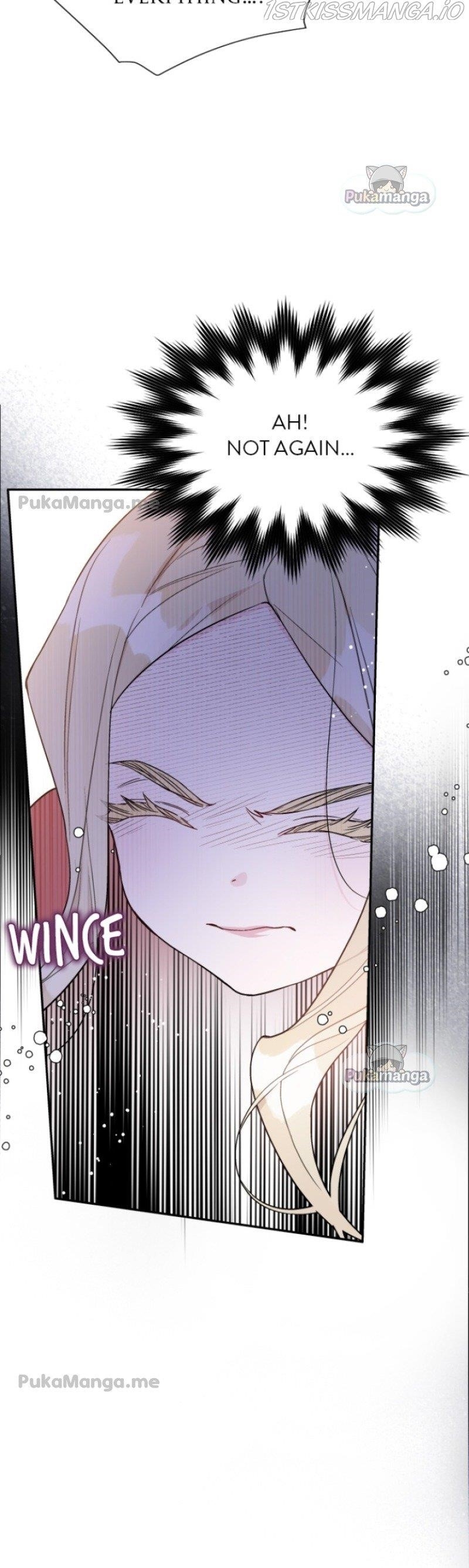
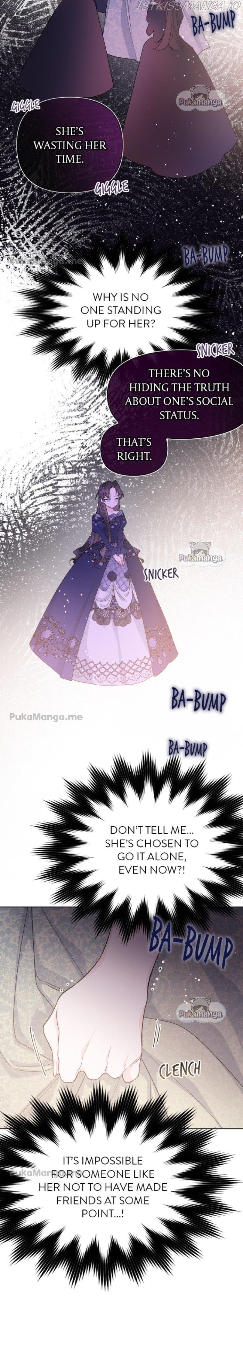
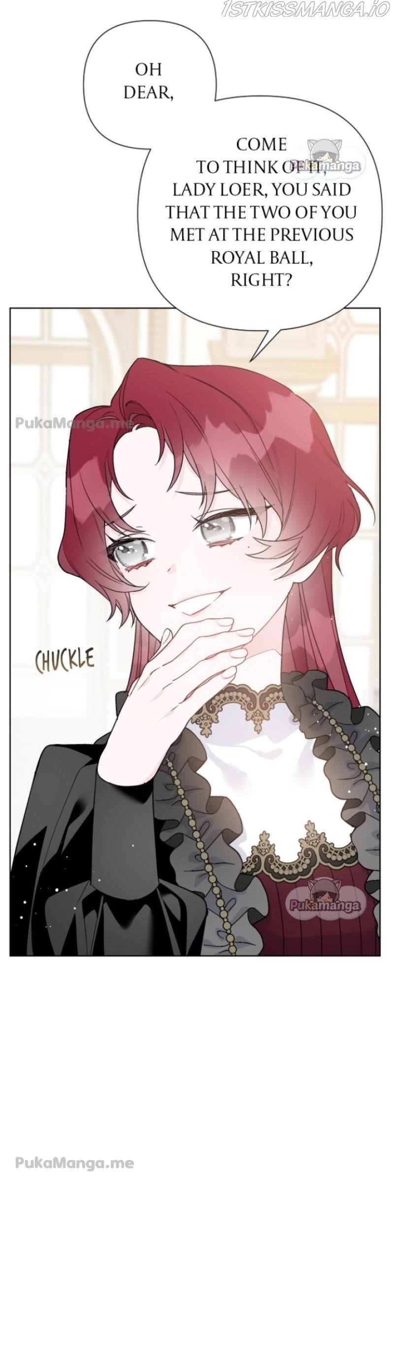
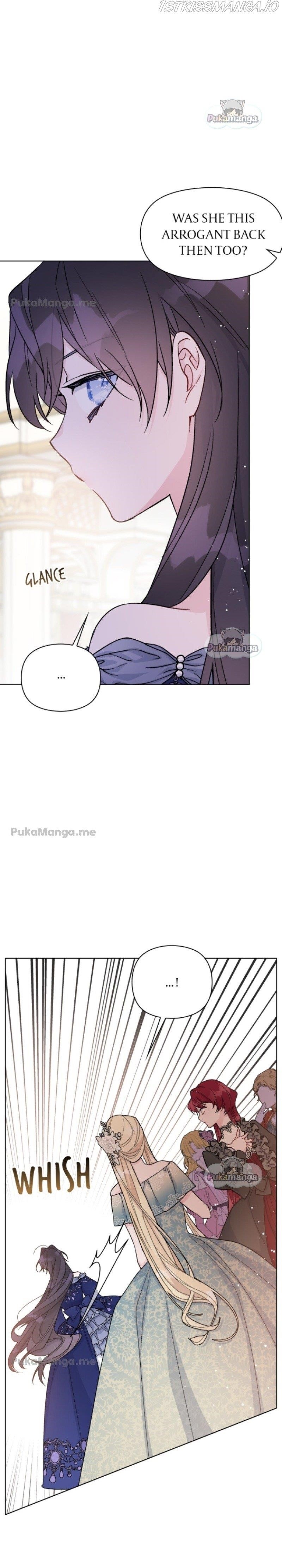
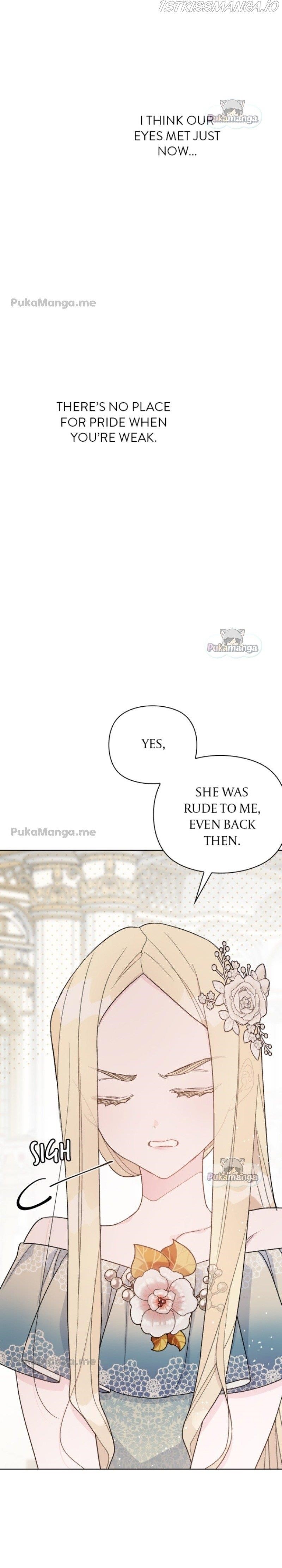
The Way That Knight Lives as a Lady - Chapter 49


Comments for chapter "Chapter 49"
Subscribe
2 comments
Cosmic clan
Demon Hunters
3 years ago
Lol how slow can this be

We will be glad to hear your comment!


Not only are the serifs and sans serifs still swapped between without any reason, but they also briefly bastardized the serif typeface. The drop shadow destroys the contrast and balance of the letterforms. The worst part is that the drop shadow didn’t feel like it was adding anything given the context it was used. It was a needless act that didn’t add anything to the story.
I also noticed the kerning on the serif typeface was lacking in some areas. I guessing the font was a free download or not intended to be used in all caps.